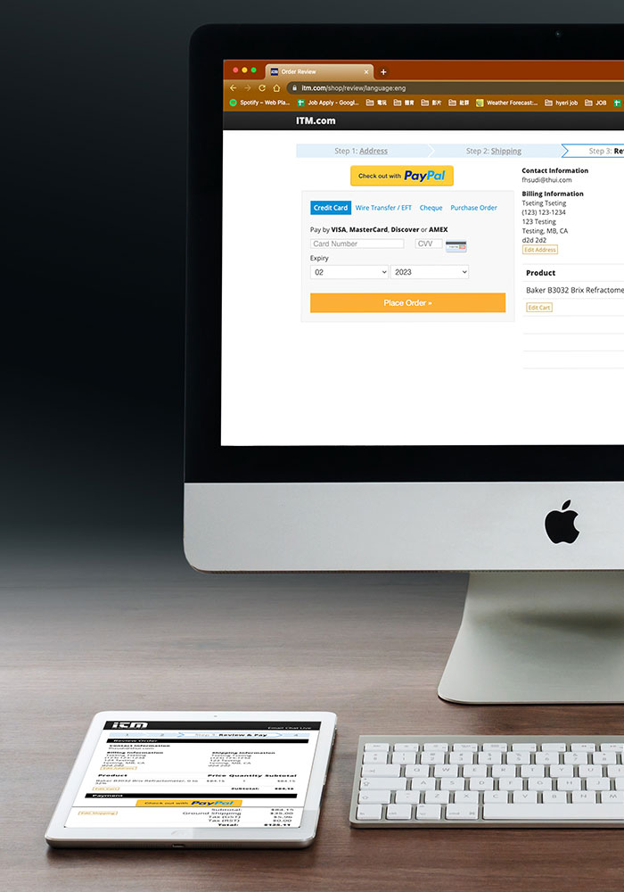
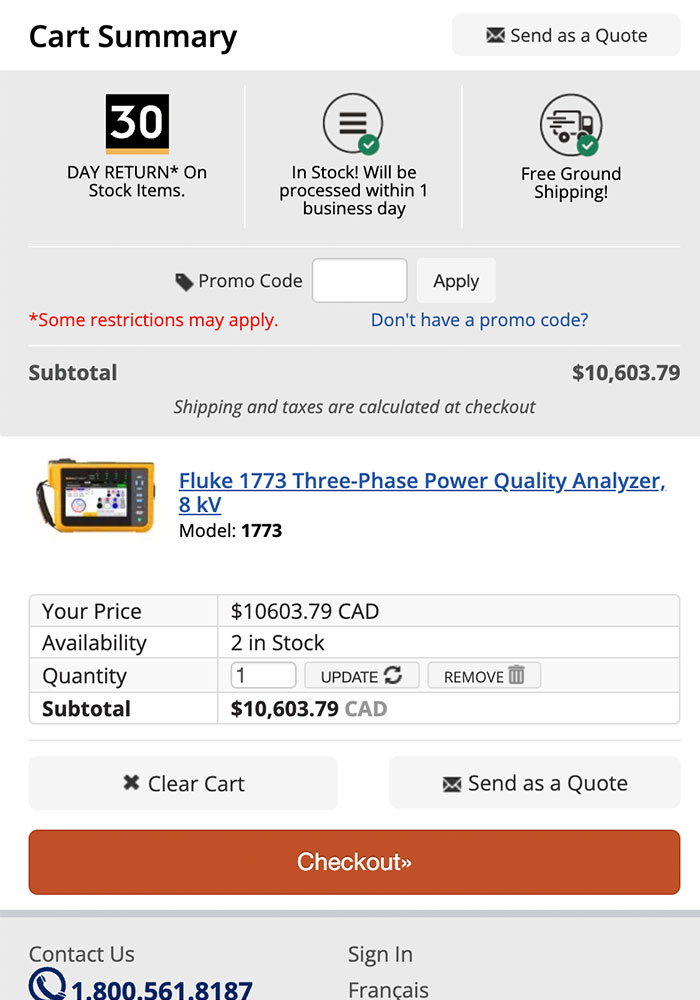
Project: Mobile Cart and Checkout Page

To improve the User Experience to provide a better checkout experience.

Project: Mobile Cart and Checkout Page

To improve the User Experience to provide a better checkout experience.

My daily work focuses is to improve the user experience on mobile devices, and here I am showing the part of the site's cart and checkout pages. As a mobile device is the new key trend, the site's design needs to be updated to provide a clear and informative experience for customers. To achieve this, I conducted extensive research on main ecommerce sites such as Staple, Costco, BestBuy, and Walmart to determine the best user experience for our site.
To ensure that the site is easily fillable, I created a user-friendly form. Additionally, I ensured that the update is compatible with all types of devices. Throughout the process, I learned not only on the design side but also on the coding side. Let's take a closer look at what we have accomplished and how all of this came together.

Illustrator Icon Photoshop Icon

Scroll Down to see More Detail!

Research, Compare and Mockup

Start

Mockup

Reference and Compare: To decide a direction of style and page layout for the later mockup.
Thought: I thoroughly explore the major ecommerce sites such as Staple, Costco, Bestbuy, and Walmart to gain insights into the customer's daily experience. I believe that the user experience is based on their actions and the products they use. By using other trending or main traffic websites as a reference, I aim to establish a connection between the customer and the new look of mobile pages.
Process:

Started by examining our desktop checkout pages, aiming to ensure a seamless transition to the mobile view. Next, I conducted a comparative analysis of checkout processes on other prominent streaming websites, both on desktop and mobile. Armed with screenshots, I generated ideas for enhancing our company's site. Simultaneously, I compiled all the screenshots to present to the manager. Ultimately, we arrived at a clear direction, which I used as a foundation for creating the mockup.
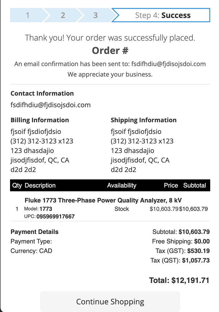
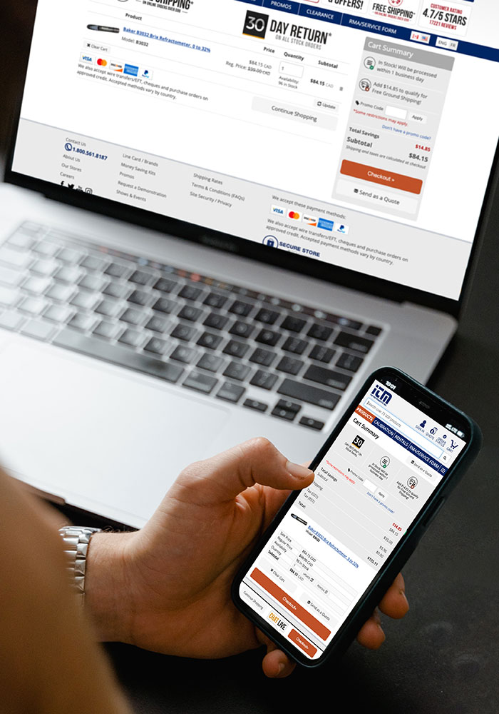
Mokcup: Based on the given direction, I crafted several design ideas. These concepts were thoroughly discussed with both the team lead and the manager, leading to a collaborative decision on the final result.
Process:

When it comes to mobile design, optimizing space is paramount. Balancing essential information, functionality, and accommodating finger size requires thoughtful consideration. I strategically rearranged elements and adjusted button placement to fulfill user needs. Prioritizing a seamless form-filling experience enhances overall usability. The result? A mockup that resonates with the team and sets the stage for the next exciting phase: implementation.

Implementation - 1

Cart

Address

Elements: Elements position, Buttons and UX Thought
Goal: Balance between information, functions and user experience.
Process:

I have reorganized the elements on the desktop while maintaining the original hierarchy to ensure consistent eye flow. Simultaneously, I adjusted a few icons to better fit the mobile view. Additionally, I introduced a few buttons to enhance convenience and maximize the user experience. To provide essential functions throughout the page, I incorporated a sticky footer.

Elements: Progressing Bar and Form
Goal: To creat a user friendly form.
Process:

To enhance the checkout process and provide customers with a clear understanding of their progress, I've introduced a progress bar. This visual indicator helps users track which step they're currently on. Additionally, I've fine-tuned the validation settings to provide better feedback when essential information is missing. Now, if any required fields are incomplete, users will receive clearer prompts. Furthermore, I've included a convenient “Continue” button for customers who choose to reuse the same information for shipping. This streamlines the process and ensures a smoother user experience.

Implementation - 2

Shipping

Review

Success

Elements: All element on the site from Nav to content.
Goal: To keep the needed message.
Process:

While updating the mobile view for the shipping page, I also revamped the desktop appearance. Notably, I transformed the options into radio buttons for a cleaner look. On the mobile version, I maintained the existing layout but removed redundant messages that were displayed across multiple pages.

Elements: Order Review and Payment
Goal: Easy payment options and Clear review information
Process:

On this page, we have two primary focuses. Firstly, we provide order information to assist customers in doing a final check before proceeding with payment. Secondly, we ensure that payment options are user-friendly. To optimize the mobile experience, I've split these two main focuses into separate tables, allowing ample viewport space. Additionally, I've maintained the Price details as a sticky footer for an enhanced user experience.

Elements: Detail Information
Goal: To provide clear information for customer about their order.
Process:

On the success page, the entire checkout process is nearing completion. To maintain consistency and provide a seamless user experience, we've retained all the relevant information for the customer, just as we did on the desktop version.

Execution and Result

Execution

Result

Challange: Spacing, Coding and Testing
Solution:

In mobile design, the challenge often lies in optimizing limited space. Determining the right amount of spacing between elements is crucial. Consider factors such as varying finger sizes, input preferences, and user backgrounds. However, the most critical factor is time—how to maintain simplicity while delivering the necessary performance to meet customer needs. Extensive research and thorough testing are essential. Studying successful streaming sites can provide valuable insights. After all, many customers have years of experience with platforms like Amazon, and their expectations form a pattern we should learn from in e-commerce design.

Result:

The revamped mobile Checkout and Cart page design has proven effective, resulting in increased traffic from mobile devices and improved sales conversions. However, a few issues have surfaced, including data loss when navigating back, content being obscured by pop-up modals on certain device screen sizes, and other related complaints. To address these challenges, we continuously investigate user feedback, meticulously analyze Google Analytics data, and devise solutions. If you'd like to explore the site and experience these enhancements firsthand, feel free to visit the link provided. Your feedback is valuable!

ITM Instruments